Monday 25 November 2013

Research - billboard Magazine Analysis


  •  Latest Edition about Music awards rather than artist
  • The award is for ‘Maximum exposure’- this could be a pun relating to previous music award shows where different artists have been ‘exposing’ themselves in front of thousands. The term ‘moving the needle with signature moments’ could be a reference to a seismograph, where a needle moves due to earth tremors – could be suggesting that these performance are causing tremors through the public, with ‘signature moments’ that the public won't forget, for example, artist such as Miley Cyrus. Could also mean how the ‘American music awards and other awards shows’ are progressing/ advancing in the music industry / putting pressure on each other.
  • The background of the magazine is a purple curtain – much like the curtain you have at awards shows, however they are conventionally red – so could be challenging codes and conventions by using purple.  ‘Billboard’ logo bold and white against the curtain – they are using the traditional billboard font.
  • Puffs of info are little – one linked to main feature, with two others including other features of the magazine – ‘over 120…best  ...’ – make the public feel they are benefitting from buying the magazine – getting valuable information that’s the ‘best’.
  • Also another puff at the top – following the title – also states other features of the magazine like artists. 


Research - NME Magazine Analysis


  • Main focus of the front cover is the main picture – very little information puffs – only one with a rhetorical question about the subject MIA.
  • Picture is a close up of MIA and her hand, sticking her middle finger up at the reader. Gives the impression she does not care what people think of her. However facial expression does not come across as aggressive.
  • Whole front cover is in colour co-ordination. The red ‘NME’ logo matches MIA’s hair colour, whilst her eyeliner is the same green as the ‘M’ block. Followed by a pink ‘I’ block, the same colour as her lipstick, and the last block, an orange ‘A’ matches the colour of her nail varnish. This follows a co-ordinated pattern down the magazine. There seems to be little reason for this, but it is a creative design.
  • ‘You just can’t take her anywhere can you?’ suggests that the reader knows MIA well – rhetorical question also involves the reader, makes them feel directly addressed by the magazine, interactivity.
  • Also little tabs by main ‘NME’ logo – mentions who/what is also included in the magazine, but does not give information. The fact that the magazine does not tell the reader what’s inside may entice them more to buy it and have a look. This could also let the magazine down though, as the reader may not feel they are getting anything out of buying the magazine.
  • The photograph pixelates MIA's middle finger, but also the edges of the green puff below it are pixelated. This links the text and action together, so the reader knows that the puff is about the artist featured.


Research - Q Magazine Analysis


  • Medium Long shot of Jake Bugg with his guitar – music signifier
  • ‘Sticker’ next to Jake – ‘His most revealing interview’- intrigues the reader, feel they are getting to know Jake better. Something special for this magazine
  • Gossip article – ‘dating models’/ ‘hanging with Noel’- find out something about another famous artist / ‘why he feels so guilty’- curiosity will entice the reader – may feel closer to him, because he’s telling the audience his guilty secret.
  • Names of artists in puffs are different colour to the rest of the text in the puff – makes it stand out more- but also keeps in with colour scheme.
  • Also contains list of other featured artists – multi-coloured to make it more eye catching.
  • Brown guitar stands out bold against Jake all in black. Black leather jacket also has connotations of rock and roll – signifier to genre of music.
  • Challenges codes and conventions- no eye contact with the reader- unusual, because he is revealing a lot to the reader – but won’t give eye contact/ connect – may suggest he is ashamed of his secret.
  • Section about Bob Dylan- a very famous artist also featured on the front cover – not as important as Jake Bugg – main feature, but more important than the other artists mentioned on the front page – so highlighted in yellow with black writing – looks like police tape
  • ‘Special!’ again encourages the reader to buy the magazine – feel they are benefitting from buying it.
  • Conventional ‘Q’ logo – signifier to the magazine- music genre they cover – people who buy Q know what they cover. Bright red stands out against the rest of the colour scheme.
  • ‘Jake Bugg’ written in an odd font- irregular – could be a signifier to Jake’s music genre- could entice the reader because they think he might be a little bit odd. – Lettering placed over his body so white contrasts with his black clothing.
  • Puffs contain the oddest points of the feature to intrigue the reader – ‘talk burning rats, bum tattoos...’ - Reader more likely to enjoy if there is a bit of comedy included- appeal to more people.


Sunday 24 November 2013

Construction - Artist's Album Cover

 Album Cover Image - Draft
I chose this image as my final album cover photo, because it has a direct address with the audience and is more inviting to the consumer. It shows the artist being quite serious, but it adds a mysterious sense to the album that will intrigue consumers to buy the album. I also feel it is the perfect representation of my artist, because she does take her career seriously, but also likes to have fun with it. The image also includes part of her clothing, which relates to the alternative genre of music.

Photo option for the album cover.
i liked this close up shot of my artist, because she is framed well, and has a playful look to the image which I feel would represent my artist well. However, there is no eye contact with the camera / audience, which may give the impression she is a little withdrawn.

I liked this image, because it shows the artist smiling, and also has an interesting reflection in the shot, making it seem more abstract. Again it shows an accurate representation of my artist, but there is no eye contact.

This image shows my artist to be a lot more serious, but the fact that she's playing the guitar makes it more suitable for an album cover. I also like the use of contrast and the bright light, which makes the image a little more intense. A little editing will be needed to improve the background, but overall I think this is a successful image.


Saturday 23 November 2013

Construction - Double page spread (so far)

 This is my initial image, without any editing on either photoshop or iPhoto.

 This was my image after  I had edited it on Photoshop. I enhanced the colour and saturation whilst lowering the contrast and increasing the exposure a little to give a brighter and clearer final image.
 This was a draft I have been working on before I had enhanced and edited the image. I tried working with different opacities for the boxes, and also different angles to make the pages more visually interesting. I also experimented with colours to see which stood out the most against the background image, including font types too.

Thursday 21 November 2013

Planning - Possible front cover photographs

These are some of my options for front cover photographs.
This first image, although suitable for introducing a new artist, I feel would look better as a double page spread rather than front cover image.
 This also a suitable image, although I'm not completely happy with the editing on this image. I used Photoshop to complete the editing, which is a software I have little experience with, although I don't think I did too bad for a first attempt.
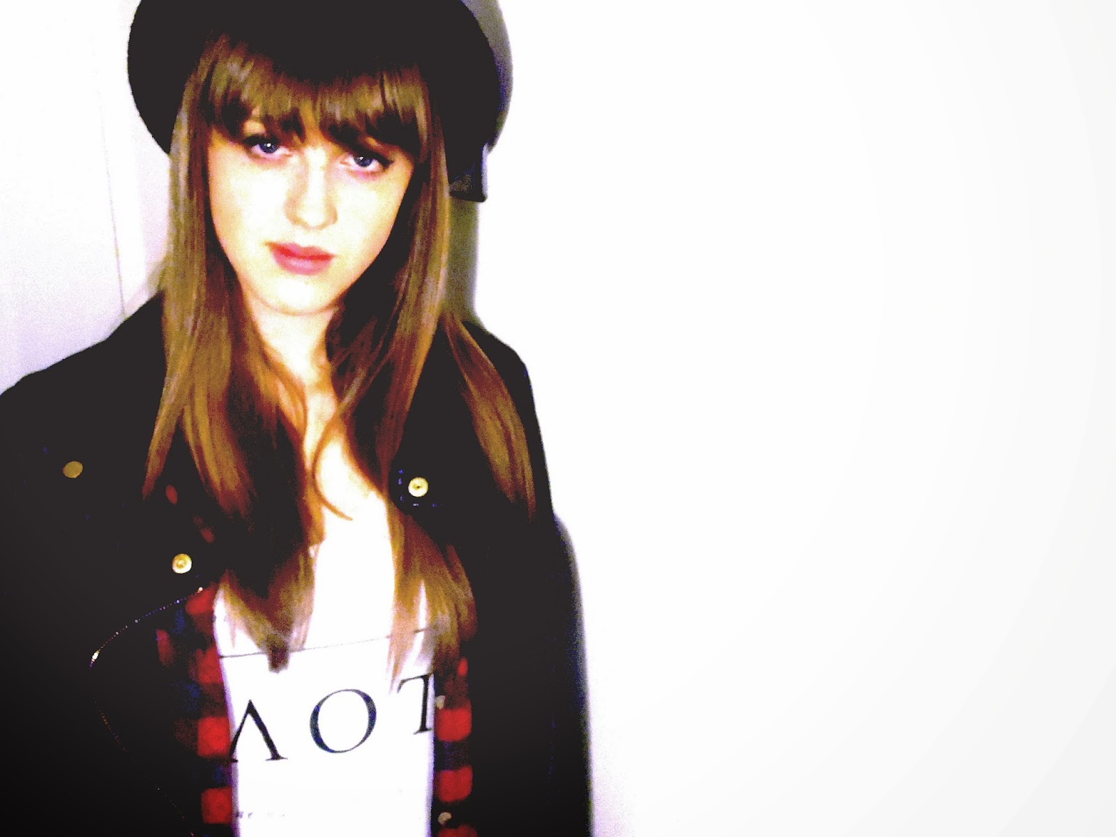
The majority of these photo's will need re-editing, because I feel that I have over-edited them a little too much, including this one as the exposure is way to high and the contrast is way too low. However, by experimenting like this, i have better understanding of the Photoshop software. I particularly like this image because the artist is looking directly at the audience/ Reader, and the artist has a very open and welcoming face that would attract the reader.

 This is a good close up image of my artist, although I feel the lack of eye contact would not seem so appealing to the audience. I think this is a very professional looking photo for a first attempt at proper photography of a person. Again I have over- edited the image, so would have to redo.
I really like this image too, it is very visually interesting with an abstract edge to it with the reflection in the mirror. I had very little to edit on this picture as all the lighting and colouring were pretty accurate in the initial editing, I have just lightened the picture a little to brighten it up. However, I still don't feel it is front page worthy, and would be more successful as an album cover for example.


Wednesday 20 November 2013

Planning - Lexicon of Words

Alternative
Melodic 
pop-rock
Riffs
Hooks
Acoustic
Ballads
Emotive
Guitars
Patchwork pop
Energetic
Gigs
Internet
Underground
Mainstream

Tempo
Solo
Debut

Monday 18 November 2013

Lily Allen- Hard Out Here - Music Video

http://www.youtube.com/watch?v=E0CazRHB0so

I think that Lily Allen's new video is very effective at highlighting the inequalities between men and women that still exist today. I believe it's a very accurate representation of some of the stereotypes women face, although still a little controversial, but that is just another reflection of society. I think it's unfair for Lily Allen to be compared to other controversial artists, such as Robin Thicke and Miley Cyrus, because her views are in favour of women, not degrading them. The method she uses to portray this, if misunderstood, could seem as if she is degrading women, but the video is so obviously sarcastic showing the audience that she is just emphasising how outrageous these other artists are. Adding a little controversy and humour makes sure that the video gets good press, and resulting in making it a wider known message, making sure she gets her point across. The fact that the video makes people uncomfortable emphasises even more that this kind of view and representation of women should not be acceptable. When I first saw the video, I was a little uncomfortable, but I was more surprised by how little it actually shocked me. These kind of videos should not be so common, that people begin to see it as normal behaviour, a point I feel Lily put across perfectly.
It was a very brave decision for Lily, as she would have been aware of some of the complaints she would get, but it shows that she is standing up for her views, not just doing as she's told, especially by male executives, as she expresses in her video.
Lily uses features from these other controversial artists, such as the balloons from Robin Thicke's video and Twerking from Miley Cyrus's video, but uses them in a humorous way, mocking these other artists, and highlighting how wrong these portrayals of women are.
Lily Allen shows her feminist views in this video, which I find admirable, as it seems no other artists have had the confidence or willingness to do so before.

Friday 15 November 2013

Planning - Youth Subculture Collage

This collage is supporting evidence of my Youth Subculture/ Reader Profile
My Magazine is aimed at young people aged 15 to 25, who like pop-rock/alternative style music. These teenagers are socially active, either on social networks or out and about with friends. They like to shop and experiment with styles and are also a confident audience that like to have fun and do not take themselves too seriously. They are passionate about music, always on their ipods, playing instruments or at concerts, contributing massively to the music industry. The kind of music they like is not always necessarily in the charts, but are relatively well known amongst the genres audience.

Wednesday 13 November 2013

Research - My Sixth Form Magazine- Annotations and Denotations

The Arctic Monkeys


The Arctic Monkeys were an unsigned band that promoted themselves. They had no idea how to publicise their songs on the internet, so resolved to creating free demo cd's of which they handed out to the public. These cd's became known as beneath the baordwalk, and often are mistaken for their first album. Their fanbase quickly widened as their accumulated fans created a famously popular MySpace page of which the band had no idea about, or participation in, helping to make them more well known.
As the Arctic Monkeys became increasingly popular across England, BBC Radio and Tabloid press became increasingly interested in them.
The band played at a number of festivals such as Reading and Leeds for unsigned or unknown bands, where they could publicise to audiences. However, due to support from the music press the turn out for the Arctic Monkeys was greater than expected.
In 2005, the banned got signed to DOMINO records.